Archive for November 30th, 2009
Graphical Distortions
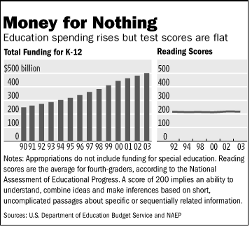
The side by side chart used in a Wall Street Journal editorial, “No Politician Left Behind: Lack of money isn’t the problem with education,” is a classic example of independent-scale graphical distortion.
Note first that the data on the spending is is not adjusted for inflation or the growth in the number of pupils. In theory, 500 is the maximum score on the NAEP scale-scored math and reading tests, but no student ever reaches this standard. The average score for high school seniors on the same scale is less than 300. I doubt Shakespeare would get near a 500 on the test.
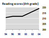
The fourth grade scores could have been scaled this way:
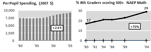
Including some more recent data, and using 8th math, we get quite a different picture:
but I’ll confess to some cherry-picking in my selection…
—
Gary M. Klass
Associate Professor
Department of Politics and Government
Illinois State University
Normal, Illinois 61790
(309)438-7852
Inscrutable Bar Graph
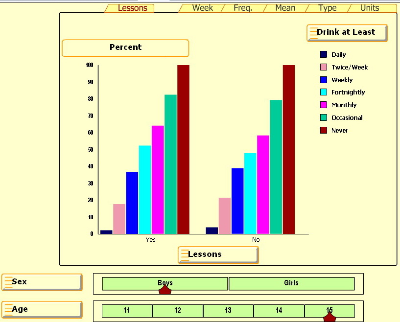
The UK Smart Centre has some great bar graphs involving alcohol usage by age and sex for kids 11-15. Press Start and select any of the five right tabs: Week, Freq, Mean, Type and Units.
But the percentage bar graph for the Lesson tab is inscrutable — IMHO 
One source of confusion is the cryptic “Lessons: Yes/No” heading at the bottom. Based on a related paper, Alcohol and a Mash-up: Assessing Student Understanding, it appears that some students had lessons on problems related to drinking (Yes) and some did not (No).
Since there isn’t much difference between the left and right graphs, it looks like the lessons didn’t have much effect on students’ drinking behaviors.
But the big source of confusion is the percentages. What are they percentages of? Notice that the “Never” group (the brown-colored bar on the right in each series) is always 100%. It seems that this Never group is the basis for comparison and all other groups are shown as a ratio or percentage of the Never group. With some effort we can figure out that about 30 percent of 15 year old boys who had lessons never drink. Can you see how?
But the real question is “Why bother?” Is there a reason this graph is so inscrutable? Or is there some way to read this percentage bar chart so it really does make good sense?


