Archive for the ‘2Assembly’ Category
Many planes crash
Full gas tanks could stop many small plane crashes (AP Nov 29, 2009).
Another example of numerical exaggeration. Turning 238 fuel-crashes in 5 years (3% of all civilian plane crashes) into “many”.
Here’s the details: “There were 8,016 crashes of civilian planes — a category that excludes commercial and military flights — from 2004 through 2008, according to the NTSB. Pilot error is blamed in about 75 percent of those crashes, which killed 2,640 people on board.
Comparatively, the 238 small planes that crashed because they ran out of gas isn’t a large number, but aviation experts say it shouldn’t happen at all.”
CONCLUSION: How can 238 fuel-related crashes in five years be “many” when it is less than 3% of 8,016 civil plane crashes in five years? Just because 238 is “too many” doesn’t make it “many.”
The number becomes even smaller when compared with the number of private planes. According to the FAA, there were 234,015 registered “general avaiation” aircraft in 2008. This number excludes mainline planes (3,743), regional carriers (2,582) and cargo planes (949). If there were on average of 50 fuel-related crashes per year for the 234,000 general aviation planes, then the fuel-crash rate would be about 2 per 10,000 planes per year.
ANALYSIS: This overtouting — this use of big words for small things — isn’t as bad as the equalling of opposites in Orwell’s 1984 where “War is Peace, Freedom is Slavery and Ignorance is Strength.” But when anything more than one is “many”, the word becomes indistinguishable from “some” and the English language becomes less robust, less able to make useful distinctions.
Sometimes the disuse of one word is not a great loss provided there is a cognitive substitute. See a listing of archaic words. But when the word has no cognitive substitute, then an idea — a conceptual distinction — is lost.
According to one dictionary, Many (adjective) means “constituting or forming a large number”
This extended usage of many to include some is another example of numerical gamesmanship.
Graphical Distortions
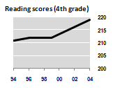
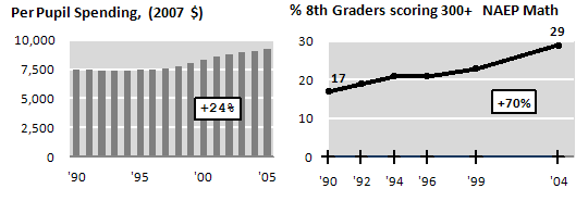
The side by side chart used in a Wall Street Journal editorial, “No Politician Left Behind: Lack of money isn’t the problem with education,” is a classic example of independent-scale graphical distortion.
Note first that the data on the spending is is not adjusted for inflation or the growth in the number of pupils. In theory, 500 is the maximum score on the NAEP scale-scored math and reading tests, but no student ever reaches this standard. The average score for high school seniors on the same scale is less than 300. I doubt Shakespeare would get near a 500 on the test.
The fourth grade scores could have been scaled this way:
Including some more recent data, and using 8th math, we get quite a different picture:
but I’ll confess to some cherry-picking in my selection…
—
Gary M. Klass
Associate Professor
Department of Politics and Government
Illinois State University
Normal, Illinois 61790
(309)438-7852
Inscrutable Bar Graph
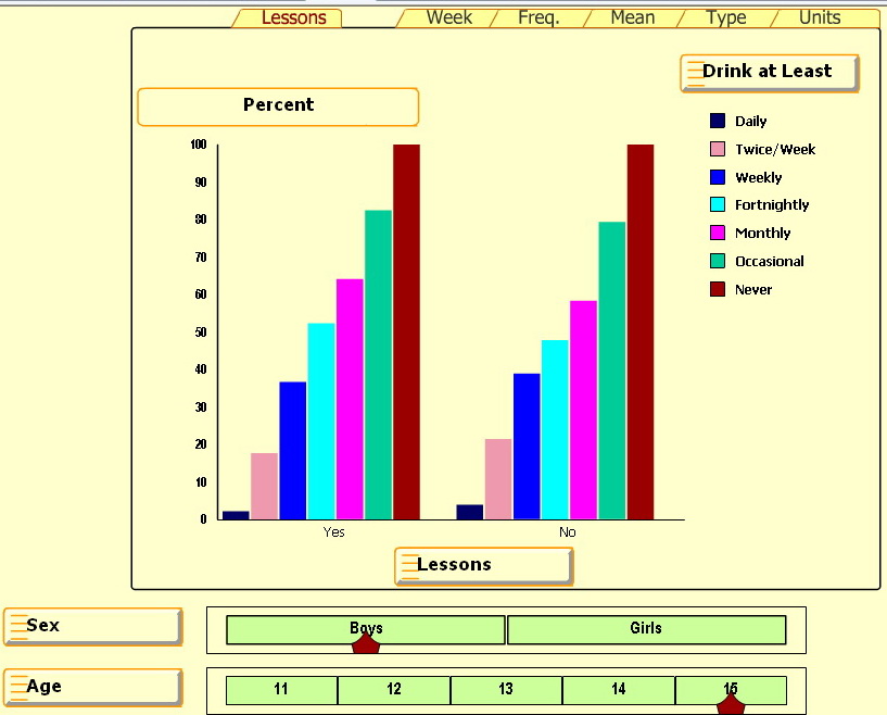
The UK Smart Centre has some great bar graphs involving alcohol usage by age and sex for kids 11-15. Press Start and select any of the five right tabs: Week, Freq, Mean, Type and Units.
But the percentage bar graph for the Lesson tab is inscrutable — IMHO 
One source of confusion is the cryptic “Lessons: Yes/No” heading at the bottom. Based on a related paper, Alcohol and a Mash-up: Assessing Student Understanding, it appears that some students had lessons on problems related to drinking (Yes) and some did not (No).
Since there isn’t much difference between the left and right graphs, it looks like the lessons didn’t have much effect on students’ drinking behaviors.
But the big source of confusion is the percentages. What are they percentages of? Notice that the “Never” group (the brown-colored bar on the right in each series) is always 100%. It seems that this Never group is the basis for comparison and all other groups are shown as a ratio or percentage of the Never group. With some effort we can figure out that about 30 percent of 15 year old boys who had lessons never drink. Can you see how?
But the real question is “Why bother?” Is there a reason this graph is so inscrutable? Or is there some way to read this percentage bar chart so it really does make good sense?
Average 2.8 M sexual partners
Check out these news-story titles: How the average Brit has slept with 2.8 million people. Ave Brit shagged 2.8 m people. Someone is going to need a bigger bed.  Here’s one story:
Brits have had ‘indirect sex’ with 2.8 million people (AFP) – Sep 23, 2009
LONDON – The average British man or woman has slept with 2.8 million people – albeit indirectly, according to figures released Wednesday to promote awareness of sexual health. A British pharmacy chain has launched an online calculator which helps you work out how many partners you have had, in the sense of exposure to risk of sexually transmitted diseases (STIs).
The ‘Sex Degrees of Separation’ ready reckoner tots up the numbers based on your number of partners, then their previous partners, and their former lovers, and so on for six ‘generations’ of partners. The average British man claims to have actually slept with nine people, while women put the figure at 6.3, giving an average of 7.65.
‘When we sleep with someone, we are, in effect, not only sleeping with them, but also their previous partners and their partners’ previous partners, and so on,’ said Ms Clare Kerr, head of sexual health at Lloydspharmacy. ‘It’s important that people understand how exposed they are to STIs and take appropriate precautions including using condoms and getting themselves checked out where appropriate.’
Now my side of the story. Lloyds has created a “statistically transmitted disease.” This disease is transmitted via sexual contact but these sexual contacts are based on a model — a statistical model. Lloyds goes out six generations beyond your immediate partners. This choice is totally arbitrary. The more generations out, the bigger the number. Lloyd’s model gets a big number by being unrealistic.
Lloyd’s model ignores five big items: the prevalence, communicability and remoteness of the disease, the order in which the sexual contacts occur, and the inappropriateness of the average.
After taking into account the five things Lloyds ignored, I estimate the Lloyd’s number is ten thousand times as big as any sexually-relevant number. Instead of 2.8 million, I estimate 280 sexually-relevant partners.
(1) PREVALENCE: If only 20% of adults have STDs, then the number of sexually-relevant partners is less by a factor of five.
(2) COMMUNICABILITY and (3) REMOTENESS: The Lloyds model assumes that everyone who has sex with someone having a STD will catch that disease. This is unrealistic. Suppose there is a 10% chance of catching an STD from a partner that has it. The chance of acquiring an STD from someone six generations away is miniscule. Averaging over the varying degrees of separation might give a total number of sexually-relevant partners that is less by a factor of at least a hundred.
(4) ORDER: To measure vulnerability to sexually-transmitted diseases, the issue is not how many sexual partners your partners had, but which events occurred first so that diseases could be transmitted to you. The Lloyd’s reckoner assumes that order is irrelevant. I’m guessing that taking into account all possible orderings to get the number of indirect sexual partners that could transmit disease could give a total number of sexually-relevant partners that is less by a factor of two or three.
(5) AVERAGE: The Lloyd’s reckoner uses averages. This number-of-partners distribution is highly skewed. There are more “rabbits” than virgins and some rabbits are very “promiscuous.” Those promiscuous rabbits will pull the mean quite a ways above the median. Assuming you and your sexual partners are not highly promiscuous, this choice is likely to persist through your chain of sexual partners. In such a case, the median is more appropriate. If the median is 70% of the mean, then the seven-generation estimate is 0.7 to the seventh power of the original: 0.08 – a ten-fold reduction. If the median is 50% of the mean, then the seven-generation estimate is 0.5 to the seventh power of the original: 0.008 – a hundred-fold reduction.
Summary: Making all these adjustments gives a total number of relevant partners that is less by a factor of 10,000: going from 2.8 million to 280. If we’re going to have a statistically-transmitted disease, it should be modeled realistically.
More technical details here and here. OK numbers people. What do you make of Lloyd’s reckoner and these adjustments?


