Archive for the ‘percentage tables’ tag
AP Misreads Percentage Table
10/22/09: The Associated Press (AP) released a story, Belief in Global Warming is Cooling, that said:
- 57% of Americans said [yes] there is solid evidence that the earth is warming [a 14 point drop from 2008]
- 36% [of Americans] said temperatures are rising because of human activity [an 11 point drop from 2008]
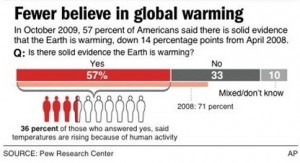
The AP also released this graph (AP ID: 09102201574) that described the 36% differently:
-
36% of those who answered yes, said temperatures are rising because of human activity.

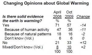
Now, 36% of 57% is around 20%. So according to this AP graph, only 20% of Americans said temperatures are rising because of human activity. This 20% would be big news if it were true. Both AP interpretations of the 36% came from this table.

Source: Fewer Americans See Solid Evidence of Global Warming by The Pew Research Center for the People & the Press. Notice that this table is a multi-level percentage table: the percentages add to more than the totals and some of the rows are indented. Percentage tables are not always easy to read – even by professionals.
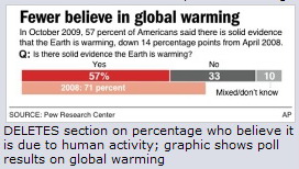
On 10/23, the AP released a second graph (AP ID: 0910222617) that deleted the 36% description used in their first graph.

Did the AP make the right decision? What do you think and why?